
A design festival for people who use type
Just van Rossum, Erik van Blokland, Petr van Blokland
Lab Portfolio time for type, typography and graphic design. For students.
You want to apply for art school, a job or start your own studio. Tips and tricks from “the old guys & girls”
This talk is scheduled for Friday, June 12 at 12:30pm as part of the main Typographics conference schedule. You must register for the Typographics conference to attend.
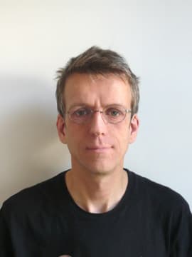
About Just van Rossum

Photo: Aleksandra Samulenkova
Just van Rossum graduated in 1989 at the Royal Academy of Fine Arts in The Hague, where he studied with Gerrit Noordzij. After stints at Monotype in the UK and MetaDesign in Berlin he became an independent type designer, focussing on software design for type. His collaborations with Erik van Blokland under the name LettError became well known and their FF Beowolf typeface has been included in the permanent collection of the MoMa in New York. His FF Lefthand typeface is as ubiquitous now as it was when it came out in 1991. He co-wrote RoboFog with Petr van Blokland in the mid-ninetees, which can be seen as a prerunner of RoboFont, and has been a very influential type design tool due to its groundbreaking scriptability with the Python programming language. His TTX/FontTools library is a crucial building block for lots of font software. He also wrote the original version of the DrawBot application. Just teaches type design and programming at the Royal Academy of Fine Arts in The Hague, both in the regular graphic design course as well as in the TypeMedia post-graduate course.
About Erik van Blokland
Erik van Blokland is one of the pioneers of digital type design and has been drawing and publishing typefaces since 1989 (available from Font Font and House Industries). One of them, FF Beowolf (with Just van Rossum) was included in the MoMA design collection in New York. Now a senior lecturer and head of the TypeMedia course at the KABK (Royal Academy of Art, The Hague NL) as well as a programmer of precision digital tools for type designers (Superpolator, Robofab) he combines the analog with the digital on a daily basis. His work centers on typographic consulting, custom typefaces, and tool development.
About Petr van Blokland

Born in Gouda, The Netherlands, in 1956, Petr van Blokland graduated Cum Laude from the graphic arts program at the Royal Academy of Fine Arts in the Hague. He has been a freelance designer since 1980. He specializes in systematic design – typically building directories, forms systems, corporate identity programs, etc. He has taught graphic design, typography, and type design for many years at the Royal Academy of Fine Arts in The Hague and at the Academy of Fine Arts, Arnhem. His first typeface is Proforma, a large series commissioned by Purup, Danish manufacturer of forms preparation systems, now released for general use by Font Bureau. His work brought him ATypI’s coveted Charles Peignot Prize in 1988. His statements on typeface design are well-known: On Quality “The same bottomline that applies to typography also applies to typefaces: when no one notices, the aim has been accomplished.” On Experience “To be accomplished in all aspects of the design process is the fundamental demand on the designer. Experience and talent counts, not the availability of equipment.” On Digitization “By carrying out the digitization as an integral part of the design process, maximum control is exercised over the eventual reproducing of the typeface, thereby avoiding any errors of interpretation.” On New Typefaces “Why design a new typeface? After all, there are so many. There is a misconception that typefaces are not designed. They are simply here. Yet new typefaces are designed and this need is increasingly present in view of the current technological advances.”