If you were anywhere near the corner of Third Avenue and Stuyvesant Street in the East Village of Manhattan on the afternoon of June 14, 2015, you may have witnessed John Downer in production mode. Throughout the afternoon Downer, a master sign painter and type designer, demonstrated his skills by painting four distinct letters on the storefront windows facing Stuyvesant Street. The capital letters, T-Y-P-E, spelled out the focus of the Typographics festival held June 8–18 at The Cooper Union, a private college dedicated to the advancement of science and art. The event included a two-day conference, a series of workshops and tours, and TypeLab, a pop-up lab and bookstore.
TypeLab was a carnival in the best sense of the word—multifaceted and bursting with energy. This typographic sideshow featured an array of enticing attractions: a bookstore with old and new editions for browsing and buying, calligraphy demonstrations, lectures on type design, portfolio reviews and critiques, hands-on workshops on coding and scripting, and a general place to meet and greet. Amidst the revelry, John Downer quietly drew guidelines, taped off edges, and painted his letters on four floor-to-ceiling windows along the street. The result was what’s known in the sign painting world as Window Splash.
Downer intuitively chose four different letter types reminiscent of his hand painted styles.¹ The basis for the T was a sign painters’ style called 4-tone Prismatic, heavy block. Tints of yellow-green and yellow-orange and darker shades of green and orange reinforced the dimensionality of this form. White was applied around the edges and atop the ridge as a highlight. The Y was based on sign painters’ Thick and Thin, which Downer modified by extending the thin stroke above the cap height. He used a green close shade to imply dimension and randomly painted colorful striations inside the letter to create pattern. The P, a flare-serif style, was painted yellow with a heavy white exterior outline and a dark blue close shade. The E was a slab serif with a yellow outline and multi-tone beveled interior edge that delineated the white center. For dramatic effect, Downer added a hunched back to the vertical stroke of the E.
¹ John Downer described the four letters and his process in an email to the author.
In some cases Downer drew the letter with a black alcohol-based Sharpie first to create guidelines for taping. In other cases he ad libbed and simply outlined the letter in tape. Paint was applied using 3” and 9” rollers, which were chosen because they were proportional to the dimensions of the letters. For example, each stroke of the T was constructed out of two 9” halves with a space the width of the tape in between. The roller leaves a delightful stippled texture when viewed up close. Details were completed as necessary with a brush and to enhance brightness some areas were backed with white paint.
Bright colors were chosen for impact and visibility from the street. Unfortunately, due to venue restrictions Downer was only allowed to paint on the inside of the windows, which reduced the luminosity of the color. Each of the two panes of glass dimmed the paint by 10%–15% and the UV protective film on the exterior of the windows reduced clarity on average by another 20%. Nonetheless, the huge letters called attention to the festival and brightened up the corner.
As permanent as the alphabet may be, its typographic applications are often short lived. So it was with these four letters that spelled out the theme of the conference. When the TypeLab was dismantled and the remaining wares packed up on June 17, John Downer’s T, Y, P, and E were lovingly scraped off the window panes and became a Typographics memory along with other ephemera of the festival.
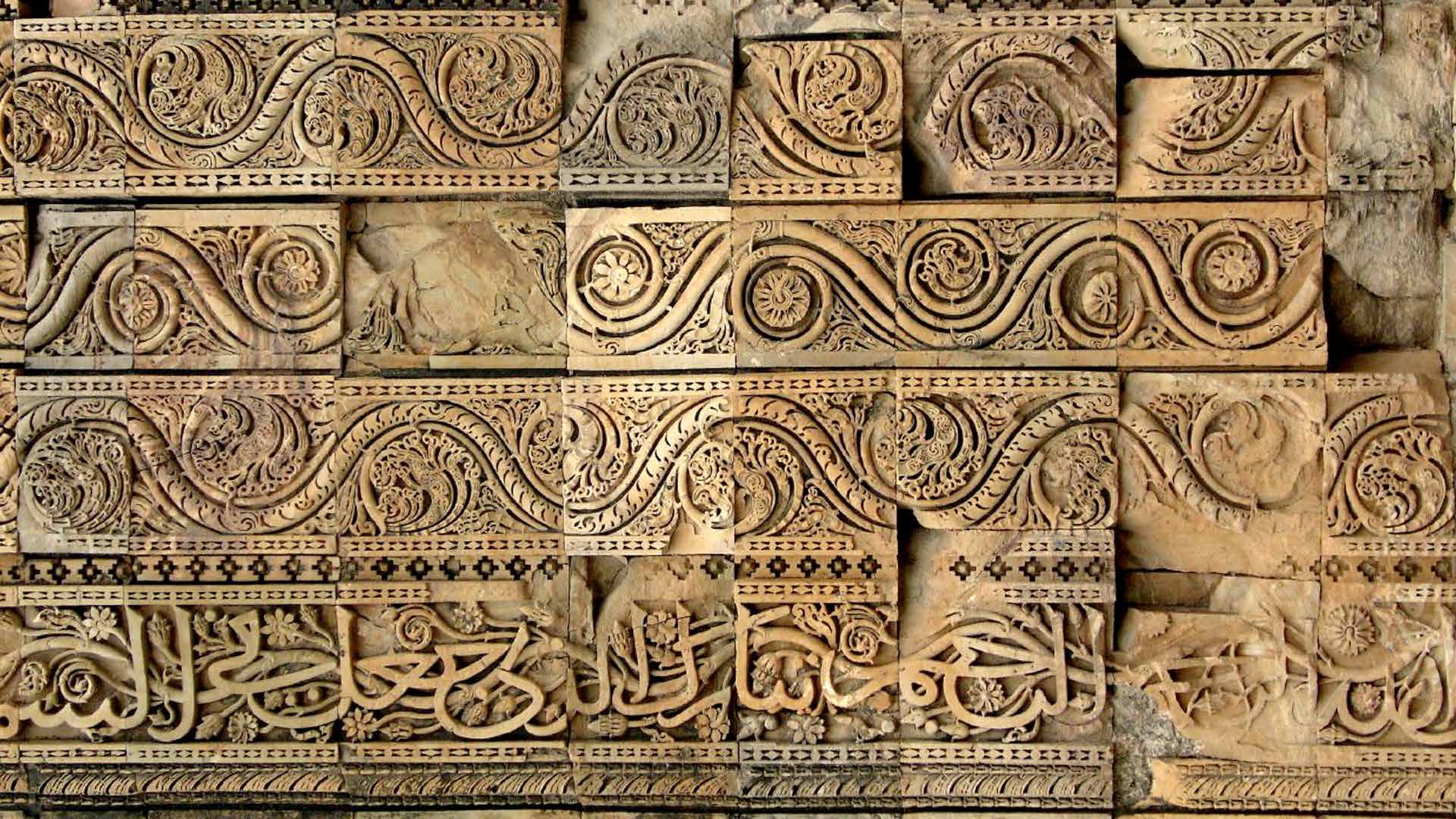
Calligraphy on the arches of Quwwat Ul-Islam mosque, Qtub minar complex, New Delhi
Painted Coca Cola sign in Devanagari script
A newspaper stand in India. (India has 82,237 newspapers)
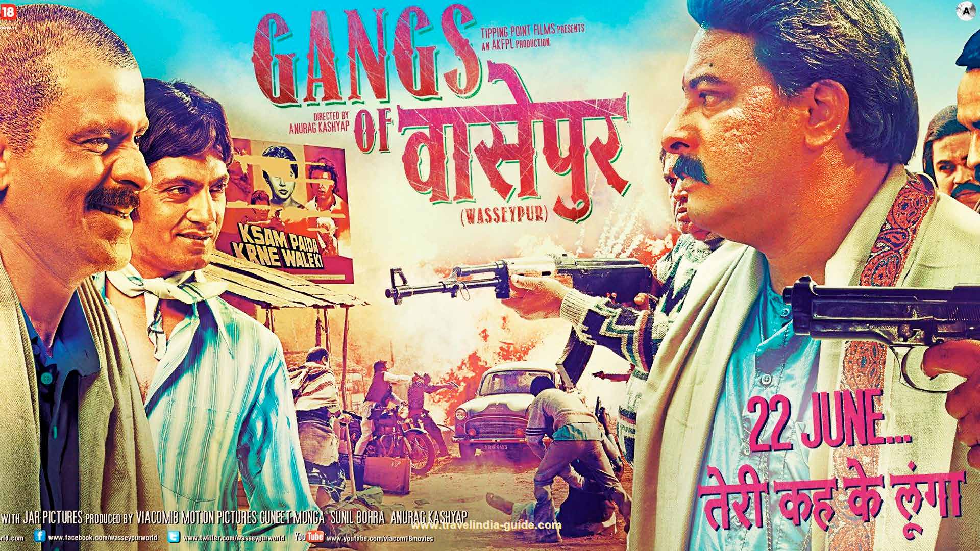
Poster of the Bollywood hit “Gangs of Wasseypur”
As globalization brings people and business into contact around the world, we are all getting a taste of type that is different than we are used to. Familiar Latin scripts are being combined with completely “foreign” writing systems.
In the 20th century, there were projects like airport signage that were multi-lingual and multi-script. But increasingly, typographers are asked to combine Latin with, say, Simplified Chinese, for global clients.
In India, there is another order of magnitude. The country has 780 languages—23 of them official. (One of them is English.) And 55 different scripts. (One of them is Latin.) This is the focus at Typographics for Andy Naorem and Neel Kshetrimayum, designers in New Delhi. Andy is a typographer; Neel a type designer.
“A good metaphor is the fusion pop music of the 1960s, with Ravi Shankar and the Beatles,” said Andy. And so Naorem and Kshetrimayum are calling their presentation “Script Jam,” which includes music and video.
“Musicians engage this mashup up with adaptation, interaction, conversation and improvisation.” Andy said. “These are the tools typographers need to approach the combination of such different letterforms.”
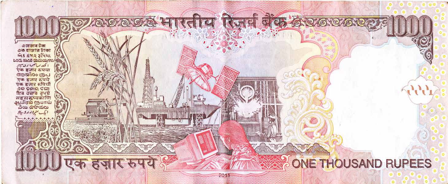
A 1,000 Rupee banknote
Neel points to a 1,000 rupee bill, as an example. It says “1,000 Rupees” in Latin, and there is a little box on the back with with 15 languages in 10 scripts. “A foreigner at first may not notice that they are all different,” he said.
Indic scripts vary, but the Latin always sticks out. There is no way to duck the problem. Only the U.S. has more English speakers than India. There, 125 million people can speak it, and for one-fifth of them English is their first language.
“Cultural multiplicity is so great that,” said Andy, “there is no one India.”
“Nothing defines India in one way. So many languages, culture, and food.”
Their presentation at Typographics begins with kaleidoscopic view of the rich visual culture of India, and shows how different letterforms are combined across the country, in signs and product branding, advertising and entertainment. They turn to multi-language typography in text—in print and on screens, show some best practices and making recommendations.
“Some of the compromised features due to the technical limitations of metal type can be brought back in digital type,” said Neel. “An interesting area to investigate is the trend in digital communication where people are sending transliterated messages in Latin fonts.”
With the economic boom in the country, the number of smart phones in India is expected to quadruple to 650 million in the next four years, according to a Cisco study.
“There is clearly a big market for fonts, and the need for a better understanding of how the scripts can work together and with Latin,” said Neel. The team is pushing for for the high-quality revival and digitization of calligraphy from the past—to bring it into the modern era.
The fusion metaphor may be useful as typographers everywhere begin to tackle the problem. When markets go global, so must typography. “And so we are moving beyond on our own languages,” said Andy. “And trying a bit of improvisation.”
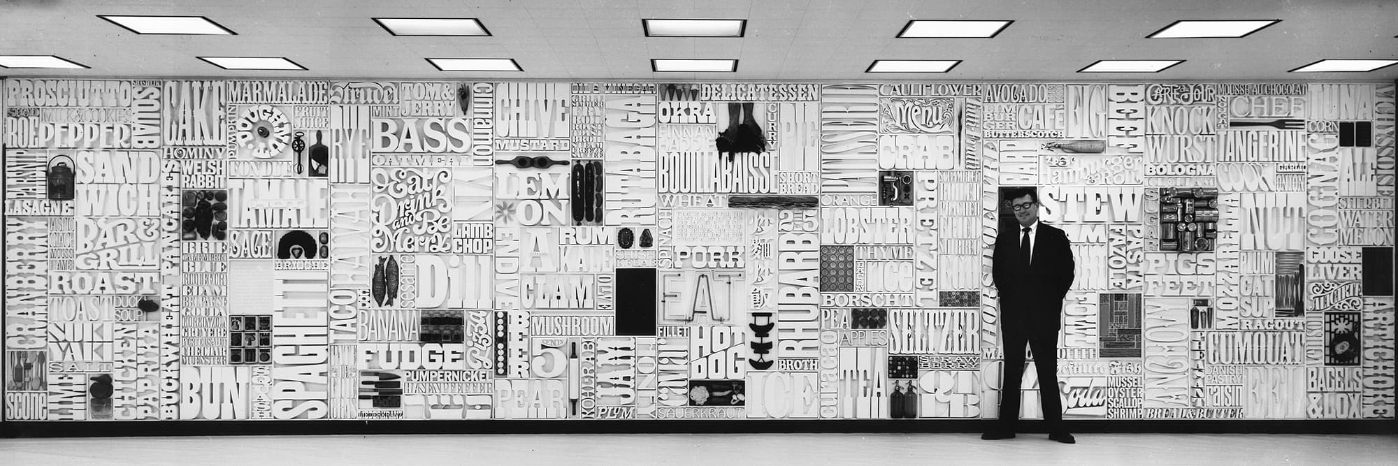
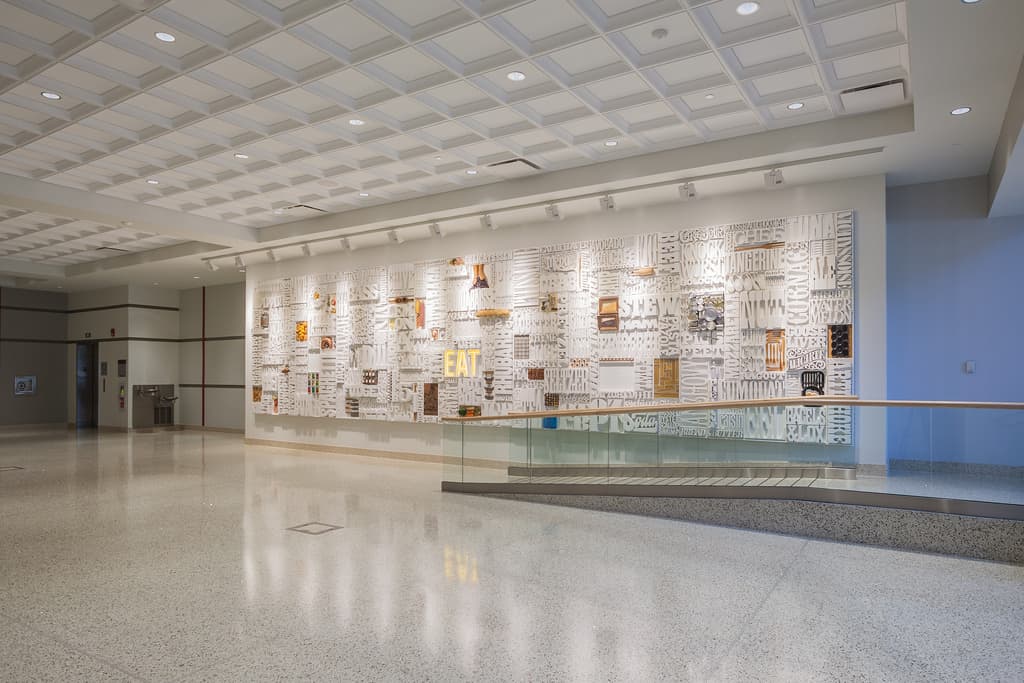
The installation created to decorate the wall of the staff cafeteria in the newly built CBS building is one of the best examples of typographics. Designed by two close friends and former Cooper Union classmates, it was a striking example of the impact of the “type-only” solution.
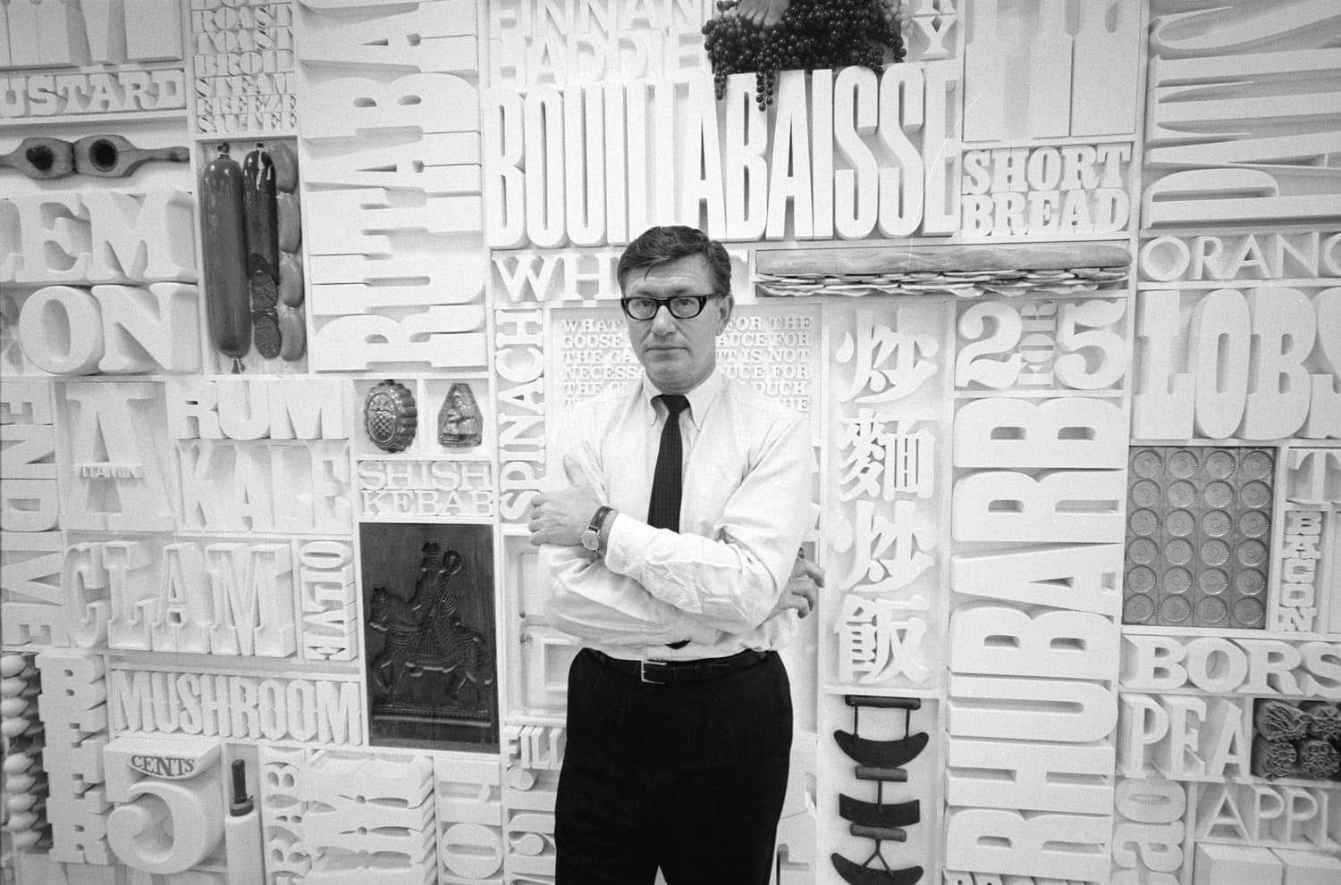
Lou Dorsfman standing in front of the CBS cafeteria wall he designed, circa 1966.
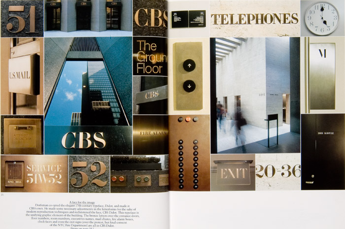
In 1965 Lou Dorfsman, then Creative Director for the CBS television network, was actively involved in the design of the interior and exterior graphics in the company’s new home at 51 West 52nd Street in New York City, designed by Eero Saarinen. He designed every aspect of the interior wayfinding using the custom version of Didot he commissioned, which was applied to everything, including replacing the numerals on 80 or so electric clocks being installed throughout the building. Best of all, he was able to somehow convince the fire inspectors to allow him to apply the same typeface to the typically strictly regulated exit signs.
Photos of the signage Dorfsman designed for the building. Spread from the Dorfsman and CBS book.
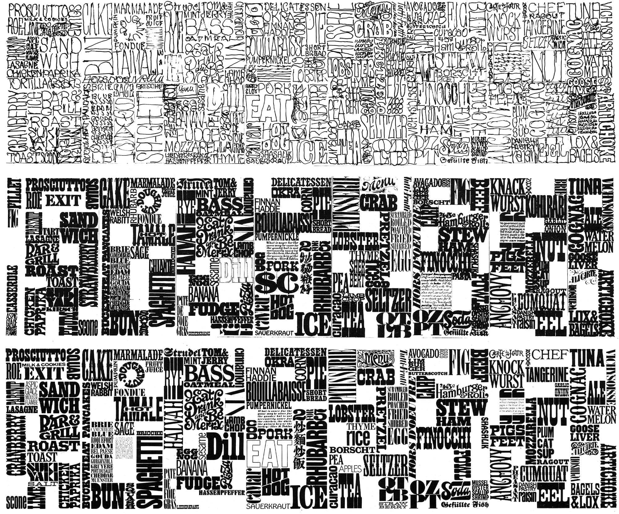
Encountering the large blank wall of the staff cafeteria he proposed to Frank Stanton, then President of CBS, that they do something with it. He suggested making a large mural based on the design of a printer’s job case, filled with cutout, dimensional words relating to food and other food objects. With Stanton’s encouragement Dorfsman executed a rough sketch, and made a full-size sample panel. Once the sample was approved he enlisted his close friend Herb Lubalin to help design the eight additional panels. Lubalin, with the assistance of Tom Carnase, worked out the remaining compositions and lettering under Dorfsman’s direction. The result was a nine-panel, three-dimensional mural (8′ high, 33′ wide) now known as the Gastrotypographicalassemblage. (The original sample panel became the fourth panel from the left in the final composition.) It was installed in the CBS cafeteria in 1966, and remained there for 23 years.
Sketches of the wall rendered by Herb Lubalin and Tom Carnase
The above sketches show the evolution of the design of the Gastrotypographicalassemblage in the hands of Lubalin and Carnase. Note that the middle panel in the sketches is missing, as it had already been designed by Dorfsman and fabricated by Stanley Glaubach. The unsung hero in the fabrication of the mural is Glaubach, who jigsawed the finished lettering for the entire construction out of pine and poplar. The wall was surprisingly complex, as the letters ranged in depth from ¾″ to 4″ (with some as tall as 18″), giving the mural a vibrant and active presence. The wall was completed by the addition of real kitchen utensils and antiques, and consisted of 1,650 letters and 65 objects.
Lou Dorfsman in front of the finished wall, circa 1966.
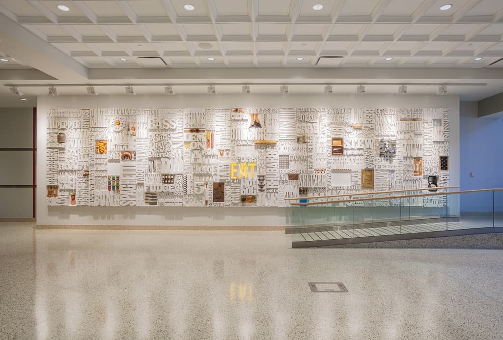
Dorfsman retired from CBS in 1987, after forty-six years of service. In early 1991 he received a call from Richard Spero, CBS’s building superintendant, telling him that the wall had been dismantled and was sitting in the basement awaiting the dumpster. Dorfsman, in turn, called Nicholas Fasciano to come and salvage what he could. The broken and battered pieces sat in Fasciano’s workshop for years until The Center for Design Study in Atlanta brought attention to it in an effort to restore it in 2008. The funding necessary for the full restoration was recently provided by the Culinary Institute of America, which has placed the wall on display at their campus in Hyde Park, New York. If you’re in New York for the Typographics festival, you must visit it to see it in person, as it is truly an astounding piece of typographics.
Lou’s restored wall on view at the Culinary Institute of America.
Article originally published in Codex magazine and has been edited and amended for publication here.
Most typographers work at a small scale. We are concerned with the page or the web site, and we can predict how our work will look without too many constraints or too much frustration. We have a good idea of who we’re trying to reach, what is our target audience, and either intuitively or through experience we feel like we know how to communicate with them. Our scale is usually in the tens or hundreds of thousands. A million uniques!—that’s a great month for us.
But two of our conference speakers are working at a different scale. Their readers, their users, number in the millions, and the tens of millions.
Jackie Goldberg is a design director at Yahoo, who is working on their original content sites, “magazines,” which launched over the last two years. The largest of them, “Parenting,” reaches 17.6 million monthly uniques, according to Digiday, which asserts while advertisers have caught on in big numbers, yet, “where Yahoo’s verticals do get points are for their design.”
Yahoo Style, on the desktop
Another success is the Yahoo Style, edited by Joe Zee, who not only has a Twitter and social network habit, reads magazines and (gasp) printed books, according to an interview in Adweek.
“There are big changes at Yahoo,” Jackie says, “with more video, and more original content.” Marissa Mayer, the CEO, has been leading the visual changes, leveraging the experience with Flickr and Tumblr, both Yahoo brands. Mayer has steadily pushed a focus on mobile.
“This is the year when we are working to bring a simplified product experience across Yahoo,” Jackie says. A big challenge when you consider its astounding reach (over 160 million monthly uniques in the U.S. alone.)
Jackie will show how the typographic effort at Yahoo is coming along. “One interesting fact,” she says, “as you emphasize the pictures and reduce the text on the screen, the typography becomes more important, not less.”
* * *
At the far end of that scale is Microsoft, which claims that 1.5 billion people in the world use Windows every day. Marty Hall has been working on the typography of the operating system for more than 10 years.
Most recently Marty has been working on the new version of the browser for Windows 10, called Microsoft Edge, not Internet Explorer. (The code name for the browser was “Spartan,” which reminded me of “Metro,” the code name for the UX design that is now the basis of Windows and Windows Phone. I am wondering if the next project would be called “Tempo,” but never mind.)
As the the new design rolls out, Marty is hoping to show more examples of the refined typography for this very lean browser design. There is a challenge to UI type on a browser, which has to be responsive, legible, and distinctive. A review in Askvg praised its “clean and minimal UI.” Edge offers the same experience for users on all devices—PCs, tablets and phones.
Marty is proud of the work he did on the “reading view” in IE 11, which introduced Matthew Carter’s font, Sitka. The basic look is moving into Edge. This typeface was a custom family for Microsoft, following the carefully-researched direction of Marty’s colleague, Kevin Larson.
With the browser launching, Marty has taken on a new assignment in Redmond, to address the biggest typographical challenge there, the type in the Windows UX. The global scale is staggering—essentially every country in the world—and a designer has to be aware of the millions whose experience with Windows dates back at least to XP (2014), which only this year dipped below 10 percent, according to Statcounter. With this global reach, UI typography has to take into account that the design for English labels, for example, has to fit into the space held for Chinese.
Typography at this scale does not want to call attention to itself, and most of us never think about it, nor should we have to. But for digital designers, the UI type is always there, if only in the background waiting to appear upon a touch, or to pop up in a notification. Over the years with PCs, tablets, and phones, the typographical problem can’t said to be “solved.” It will be interesting to see how far Marty can get with it.
Bruno Maag has been thinking about type from perspectives that are far broader than most of us tend to use. He thinks about a typeface as a brand. He thinks globally, making megafonts with Latin and Asian scripts combined. But he also thinks about type in the context of the physiological evidence of how we read.
In this last part (and I am hoping he’ll show the diagrams of the pathways that reading takes in the brain that I saw at BITS in Bangkok), he is informed, and egged on by his scientific alter ego, Dr. Alessia Nicotra. Alessia is a neurologist who is researching “type and emotion.” Her initial investigation into dyslexia and the way we read has lead to one interesting conclusion: “Different type design is not the solution to dyslexia,” she says. ”The problem that dyslexics have is not in distinguishing the letters, but phonological interpretation, by and large.”
Bruno takes a more geopolitical view. “With Latin type, it all goes back to Roman lettering, Roman stone inscriptions,” he says. “This was an early form of global branding. You can’t keep an empire that size with military force alone. You have to have branding!”
While Latin letterforms were spread by the colonial powers to the New World and Asia, and Simplified Chinese is appearing in places like Inner Mongolia and Tibet, a single letterform is not going to work over the entire planet, at least during our time. There are too many languages, and too many cultures.
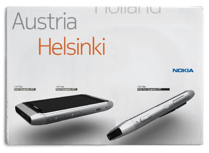
Nokia packaging showing the custom font, Nokia Pure.
“For big brands, the answer is: assemble or create compatible designs in a number of different scripts,” he says. His firm, Dalton Maag, based in London, produced a set of custom brand fonts for Nokia that could cover markets around the world. The result is Nokia Pure. “Besides Latin, Nokia Pure covers 18 more writing systems, including Chinese, supporting 85 percent of languages spoken.”
The font for Faena, a luxury hotel chain, in use in print and on screen.
My own favorite Dalton Maag custom project is Faena, designed for the luxury hotel chain that remade the old warehouse district in Buenos Aires, Puerto Madero, with the help of Philippe Starck. The typeface combines classical elegance with both meanings of the term Modern. (Alan Faena is now working with Norman Foster and Rem Koolhaas on a big project in Miami Beach.)
“The ROI for custom fonts is bigger, the bigger the company. The fun part is trying to think across the cultures, and you need a widely dispersed design team working together.” Bruno says.
But it all comes back to the mechanics of reading. “We read the same way, deciphering the same skeletal code,” he says. “When you put the neurology together with the culture, you can start saying how to make type brands that work globally.”
Christian Schwartz has designed a number of typefaces for news publications, including the celebrated type series for The Guardian, designed with Paul Barnes, his partner at Commercial Type.
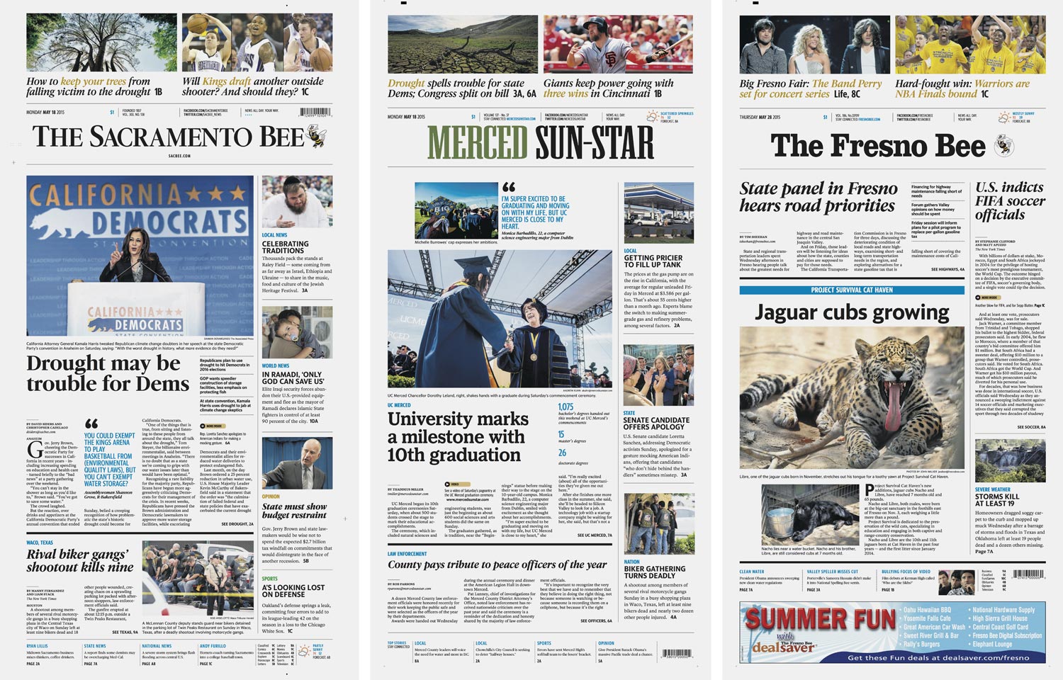
This spring he and his team produced an interesting super-family of fonts for the McClatchy Company, a publishing chain that started in the days of the California Gold Rush, including several papers called Bee – Sacramento, Fresno, and Modesto. The resulting typefaces are McClatchy Sans, drawn by Schwartz; McClatchy Serif, drawn by Miguel Reyes; and McClatchy Slab, drawn by Greg Gazdowicz.
The McClatchy type series – Sans, Serif, and Slab – all with matching character widths.
“When we started talking to Mario Garcia, the great newspaper designer who led the project, I thought that the typefaces needed an essential quality of Americanness,” Christian says.
“We started exploring display typefaces from Ludlow, the machine used by many American newspapers in the early- and mid-20th century to set headlines,” he said. “There is something purposeful, strong and decidedly American about these typefaces.”
The project was given an interesting challenge when Mario’s colleague Reed Reibstein proposed not only that they create serif, sans serif, and slab styles, but that corresponding styles share the same widths. This enables each newspaper in the chain to share content and whole pages, but maintain some of its own typographical personality.
With matching character widths, all members of the McClatchy series can be substituted without causing text to reflow.
“It took every trick I’ve learned to get three headline families to work with the same width metrics,” Christian says, “but I’m pretty satisfied with the results, if a bit surprised it works as well as it does.”
A number of news groups distribute the same content, pages, and even the same design to different cities. It’s called “hubbing.” And it’s not an entirely new idea to share layouts between titles while automatically switching fonts to maintain local identity. In the 1990s, Eduardo Danilo did this for the El Sol group in Mexico, with distinctive news brands in Mexico City, Guadalajara, Monterrey, and Saltillo.
McClatchy front pages soon after launch. Images from the Newseum. Click to view enlarged image.
But this is the first time (as far as I know) that a matched-metrics super-family has been designed for a news group, in three distinctive designs with a comprehensive set of widths and weights. And it’s not as though the serifs were just clipped off to make one style, or turned into slabs for another. The serif, the sans, and the slab have no hint that they were designed together. But they combine well, and the font-swapping works, too.
After extensive research, McClatchy rolled-out the Bees and the Merced Sun-Star. Simultaneously with the print debut, the fonts were launched on the web. Later in the year, the design methodology will spread to other papers in the group, the third largest in the USA.
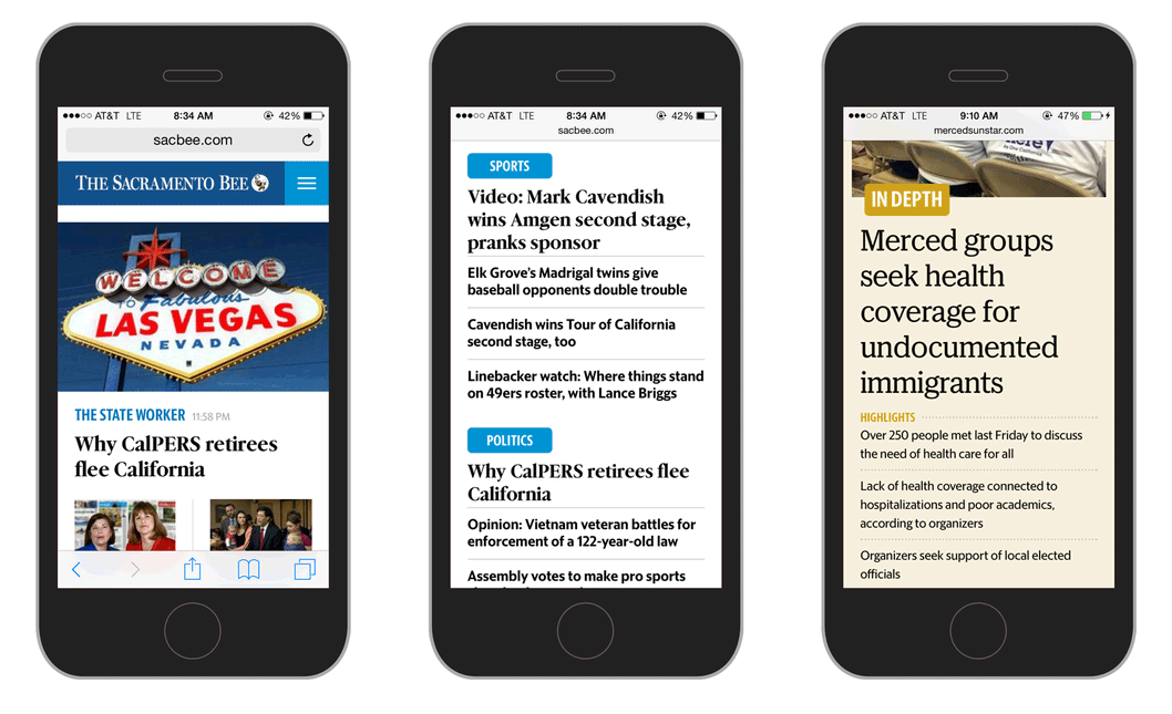
The new McClatchy type series as seen in the responsive mobile views of the Sacramento Bee and Merced Sun-Star websites.
“I think Mario and the McClatchy team have come up with a handsome, readable design that looks like a print newspaper should – and on the web, underlines the fact this is news content,” says Christian.
You wonder if people from Sacramento visiting friends in Fresno will realize that their newspapers even have the same design. And that’s the point. Loyal readers in each town can thank Christian for making some new typefaces, yet holding onto some local identity.
See Christian discuss this and other projects at the Typographics conference during his talk, “Credibility, Legibility, and Style”, June 13.
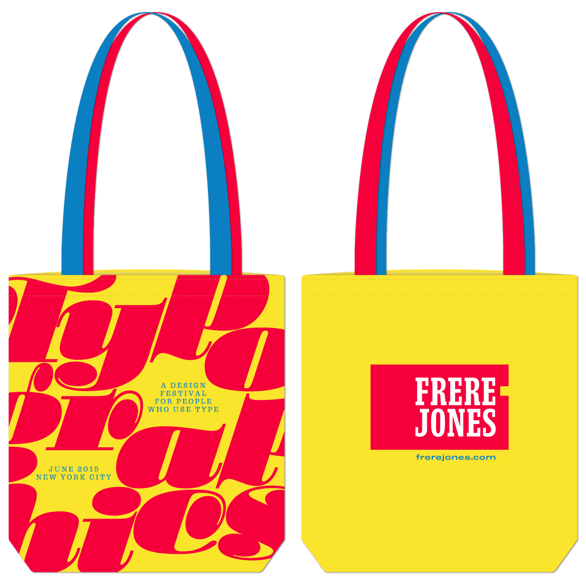
The yellow cotton bags are made in the USA, custom-sewn with one red handle and one blue handle. One side of the bag features a full-bleed print of Typographics branding with extra-large Stilla. The other side shows the shiny new Frere-Jones logo.
“I never realized there is a generally accepted rule to limit the number of typefaces you use to just two,” says Bethany Heck. “Once I heard this, it became a challenge to incorporate more than three typefaces into my designs!”
This kind of rule-breaking is what Bethany Heck, a designer in Seattle, has embraced, starting with a delightful branding project that started around baseball scorebooks, the Eephus League.
A montage of designs from the Eephus League project.
“What seems to work for me is finding something that’s really inspiring and using it for something else, on an entirely different platform”. One inspiration for the Eephus League website was paint cans.
Her work combines a rich typographical palette with very clear web design. Examples range from serious corporate work for the IBM Mobile Innovation Lab to an evocative site about wood type, End Grain. Now Heck is working on Power BI, a Microsoft data visualization service. (BI stands for business intelligence.)
“I’ve never been locked into just being a web designer or a branding designer,” she says. And her design indicates that these are all components of the same thing. For example, before she adopts any typeface for a project, “I always check to see if it’s available as webfonts”.
In her presentation at the Typographics conference, she’ll take us through the way she handles type. She pairs typefaces like wine with food. And she shows how a wider typographical palette can create a more individual design. This makes for distinct branding, but requires a keen design sense.
“In terms of the typeface choices, I follow what I love,” she says. “There are certain type designers and foundries that I keep going to back to for new stuff”.
A ticket produced for supporters of the Eephus League. “I came up with the ticket design while watching an episode of Downton Abbey one night, so if you’ve ever got a creative block, maybe stuffy British people are the cure!”
Some of the approaches Heck is planning to discuss at Typographics:
One letter is all it takes (to find good pairings)
Close but not quite (when using similar fonts together)
Setting the mood (establishing a tone of voice first)
Using contrast (the lack of it leads to muddiness in the design)
Clear heirarchy (organizing content to enrich your type system)
“I’m in the process of redesigning the website of my side business,” says Heck, “and I’m purposefully trying to use as many typefaces as possible. I’m currently at eight”.
“I want to go over the process I used and how the palette of the brand has evolved, and hopefully make the argument that all the faces work together with one voice,” she says. “Putting my money where my mouth is, as it were!”
Bethany Heck’s session at the conference should be useful for any typographer. She’s not just showing great type, she’s showing how she uses it.
Erik van Blokland (who is talking at the Typographics conference – Make It Move,” Friday, June 12th) has been thinking about making type responsive since the 1980s.
“What happens to the type when the bounding box changes?” he asks. “For the workshop, I’ve set up some tools where people can draw these things; a little animation.”
With Just van Rossum (who is leading two coding workshops at Typographics) he designed a mutable Times New Random, the characters of which were rasterized differently each time it was printed. A related idea was used for Beowolf, first released by FontFont in 1992 and now included in MoMA’s Design Collection. Operating systems eventually crippled the functionality of the typeface, but after much effort the team managed to create many of the same effects with OpenType.
“It’s taken forever to get here,” says Erik.
“Really, 25 years. We had to wait for the arrival of good resolution on screens, fast processing and Javascript,” he says.
In the ’80s Erik and Just were nicknamed the Random Twins, or the Bezier Boys. They set up shop in The Hague in 1989 under the name Letterror. And they are now having the last laugh. Dutch theories, spearheaded by Gerrit Noordzij about how fonts can become aware of their usage and how design algorithms can adapt type on the fly, were over the head of most typographers 20 years ago. Erik is now putting these theories into practice.
He is focusing on animated lettering – what he calls “the drawing of words … letters that move”.
Responsive and animated shapes for Draw Vector Move workshop at Typographics 2015 from Erik van Blokland on Vimeo.
“The bottom line is that it’s type designers who know how to do this,” he says. “Because we know how to make these variations”.
“Shape is the first restraint,” Erik says, “because the geometry of the letterforms and the containers have to be resolved”.
“The second step is that we need to be able to animate the words. We can start getting the type to respond to the way you are reading”. This may be truly responsive typography.
“We start with animation, because movement triggers a very primitive part of the brain,” Erik says.
“There is a lot of software in our brain, and we have no idea how some of it works,” he says. “But we know that the brain instinctively responds to movement”.
Louise Fili, Steven Heller, Paula Scher, and Seymour Chwast.
New York’s two most celebrated design couples – Louise Fili & Steven Heller and Paula Scher & Seymour Chwast – happen to be long-time friends. Typographics is bringing them together for a little reminiscence about the good old days of typesetting shops, repro proofs, and pasteup. Or maybe they were the bad old days.
Heller was an art director at The New York Times for 30 years. He recalls the difficulty of getting everything straight in a pasteup using waxed galleys – and the occupational hazard of getting some of the wax up your nose.
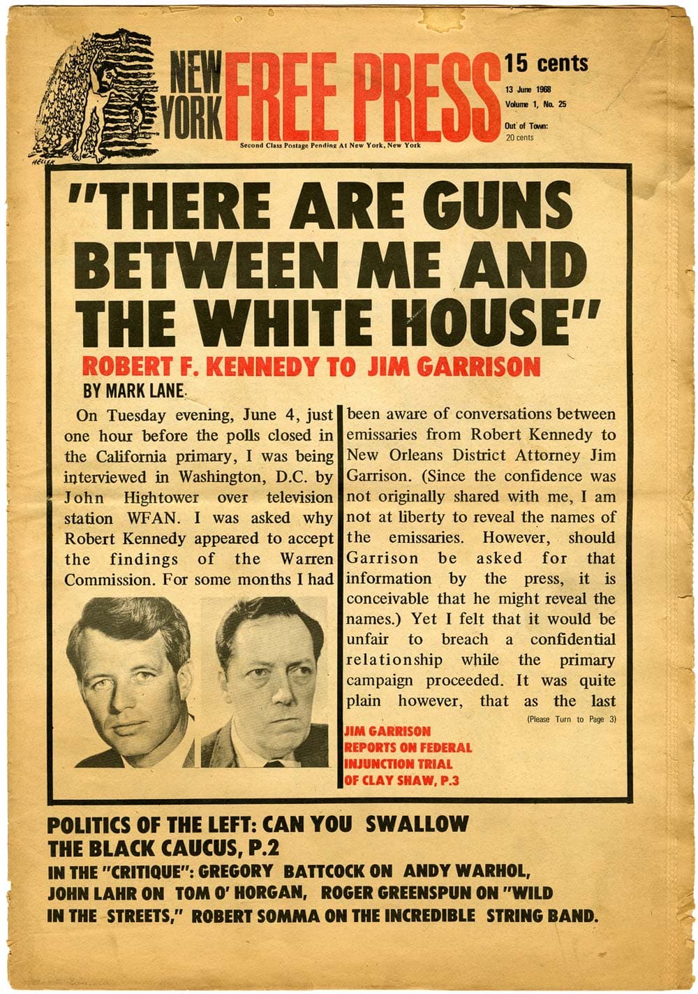
A 1968 cover of The New York Free Press, design by Steven Heller, showing slightly wobbly cold-type pasteup. Image courtesy of Steven Heller.
Fili finds irony in the fact that when using the latest phototype back in the day, “We were tyring to make things look new, and now we are doing everything we can, with the latest technology, to make it all look old!”
Chwast, before he co-founded Push Pin Studios, also worked at The New York Times, in the promotional department. He recalls getting type out of the composing room, combining it with an illustration, and sending it back down to the engraving room. “And then we had to wait six hours!”
Scher agrees it was not all that great. There was a lot of time involved. A lot of late nights – in publishing, the music business, and advertising. Messengers sometimes arrived in the middle of the night with corrected proofs, and you would wait up for them. Or you would have to rush to the airport to put the package for the printer on a plane to LA.
Twenty years later, there are fading memories of the workflow that involved paper proofs of type. You could combine repros of metal type, with phototype headlines, galleys of text, and even dry transfer lettering – resize them in photostats – and paste it all together on a board that went out to be shot for litho film.
“I’m not sure anyone wants to bring all that back, but sometimes it was really fun,” says Heller.
It wasn’t just a workflow, it was a culture.
Holiday promotional item for the Lubalin, Smith, Carnase & Peckolick design studio, designed by Louise FIli circa 1975. Fili also made the soup. Image courtesy of The Herb Lubalin Study Center.
I caught up with Steve at the QVED conference in Munich earlier this year, and he updated me on Louise’s latest work. Then I saw Paula and Seymour at the New York magazine art director’s reunion for SPD in New York. It occurred to me to ask both couples to come to Typographics and share of a little of their great history, and they said yes!
Today, Louise, Steve, Paula, and Seymour need no introduction. They have been well-known designers since these old days, and enormously influential. They have continued to adapt to change. That’s the point of this session. You can’t expect that the way we do stuff now is the way it will always be. I’m looking forward to hearing their own experiences, and their strategies for survival. Their session will be a very personal collection of stories, and a few slides, for the first morning of the Typographics conference.
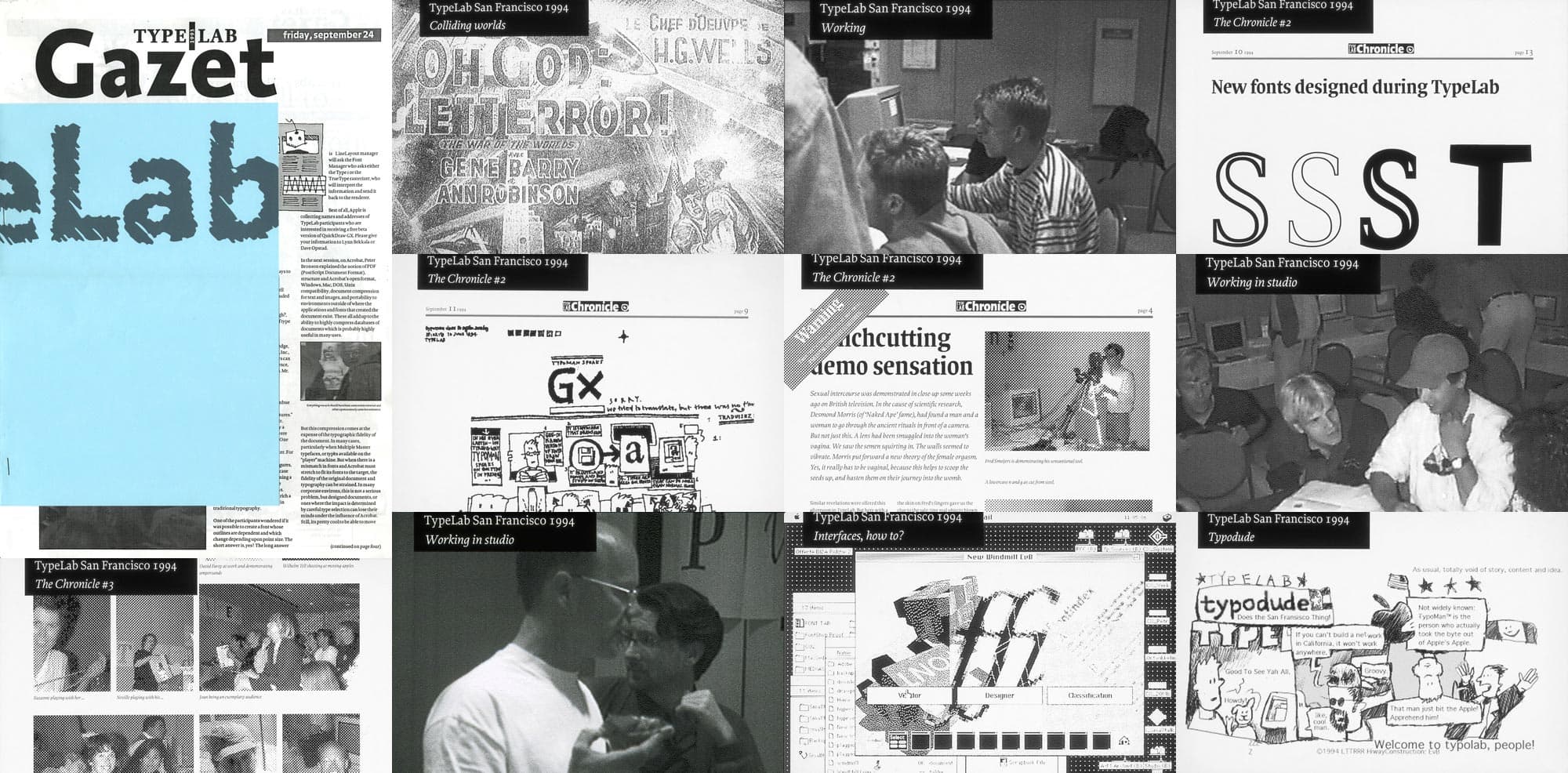
During the Typographics festival, a pop-up “TypeLab” and book store will occupy the storefront at 31 Third Avenue from June 11–15. Just a few doors away from the main conference venue at Cooper Union, the TypeLab will provide a space to explore the concept that typography today is as much about programming as it is about drawing. It will host a set of live, hands-on workshops, demos, and experiments – a multi-day hackathon for type and typography.
The idea of TypeLab was born in 1993, long before “hackathons” were a thing, when Petr van Blokland and David Berlow set up a kind of rogue DIY program in the lunchroom of the ATypI conference in Antwerp, Belgium. ATypI in those days was much more formal and stodgy, so TypeLab was organized – with very little preparation – as an alternate side program to shake things up. As Jan Middendorp describes it in Dutch Type:
TypeLab was set up as as an informal meeting where attendants could converse, compare notes, get hands-on experience of type design software, and jot down improvised typefaces. […] It hosted informal events such as lettering classes, demonstrations, and public interviews.
There was much exploration of new tools for digital type and typography at the time. David Lemon’s distribution of the call for the first TypeLab event – “posted for Petr, who doesn’t have direct Internet access”, and amazingly still accessible online after 22 years(!) – set the tone:
All participants are requested to bring their opinions in order to use them. […] The tools change, the applications change, but writing, the basic principle of type design and typography, remains the same and is stimulated, not threatened, by new technological or social developments. Rather: Typography and type design seem to stimulate the development of technologies, not the other way around. The emergence of new technologies does not mean there is a crisis in the typographic tradition. It is just means more work: Typography has always been about applying itself to different technologies.
Throughout the TypeLab events, a newspaper was edited, designed, and published – with typefaces developed during the process – recounting the activities and providing a platform for pushing the limits of desktop publishing which was still a relatively novel concept at the time. The newspaper also published short essays, like an article by Robin Kinross describing the process of making Fred Smeijers’ book, Counterpunch.
The TypeLab idea was repeated for several years at ATypI until the two events were practically merged.
This year during Typographics, Petr van Blokland will lead another edition of TypeLab – this time with a focus on 21st-century type, technology, publishing methodologies, and design thinking. Many participants of the original TypeLabs will be on hand as well, including Erik van Blokland and Just van Rossum. True to the original TypeLab it will be informal, experimental, and done by the seat of our pants. Programming may include (but isn’t limited to):
Short workshops
Design critiques from speakers and workshop leaders
Type design demos
Technical experiments
Collaborative coding projects
Impromptu presentations and debates
Live reporting
A journal/publication
Exhibit
Games
Explorations in all things type and technology: CSS+HTML, responsive layout, digital publishing, variable fonts, parametric design, Python scripting, and much more
More information on the TypeLab events will be announced over the next several weeks, so follow @TypographicsNYC on Twitter or join the Typographics mailing list for the latest updates.
I like conferences. A good conference is the right mix of learning interesting stuff you didn’t know about, and meeting people you are glad to know. And of course hearing a few things that confirm your opinions, and seeing some old friends you’d been meaning to get in touch with.
Stop me if you’ve heard me say this, but we seem to have a lot of graphic design confabs and several good shows about type design, but few about designing-with-type. That is, typography. There is the Kerning conference in Faenza, Italy just the week before Typographics. We actually moved the dates when we found out their timing, so that true typography fanatics could attend both. Like Bruno Maag, who is speaking at both.
Over the years I’ve learned a bit about what makes a good conference,by actually getting involved in planning them. There was Type 1987 in New York, sponsored by TDC, where Neville Brody gave his first talk in the US, and Adrian Frutiger was on hand to accept the TDC medal.
In 1990, I pushed ATypI to turn their dry annual congress into a big conference, and we set it up in Oxford, England, at the behest of the great Robert Norton, who’s office had moved there. A young Jonathan Hoefler did the logo. Some 700 people showed up. The lectures were excellent, assembling an amazing group, with the new stars of digital typography and type design. But what I remember most are the things that happened outside the halls. A crazy font-building session sponsored by Apple, fueled by beer, where Jim Parkinson showed the stuff he is made of by finishing a perfect glyph. Then there was the night in Christ Church (with its Christopher Wren tower) hosted by Georgiana Greenwood, who thought she was breaking a curfew, and the stern reprimand I got from the college rector about the sound system.
Never mind the fending off of the swan attack while punting with Patricia Bradbury down the Thames. Or, later, learning the Macarena – at the beach bonfire party during the 1996 SPD conference in Monterey, CA – from Mariana Ochs, months before it came to New York.
A great conference is more than an intellectual pursuit. It’s tribal bonding. Those of us who like type, who’ve based our work on typography, are small group, compared to, say, auto insurance reps. We’re happy to be in a place where there are a lot of people like us, where you don’t have to explain what an Aldine octavo is, or the meaning of CSS.
We started planning an intensive two-day conference, June 12-13. Then Cara Di Edwardo, the doyen of Type@Cooper, thought it would be good to surround the conference with with two weeks of in-depth workshops, where you can learn directly from some modern masters. And she did! she has arranged tours, led by experts in typographic history, design, and coding.
Then nearby, in a storefront at 31 Third Ave., there is Typographics Lab. Organized by Petr van Blokland, this is a “happening” space, open to all participants and anyone else who registers in advance. It will be part hackathon, part Hyde Park corner, with informal workshops, design critiques by speakers and workshop leaders, impromptu presentations and debates, an exhibit – and games. Volunteers are planning some live blogging and a print publication. If you want to get involved, registration and contact details will be published soon.
* * *
At the beginning of April, I got to do a dress rehearsal of the conference part of Typographics, in Washington at the Society for News Design convention. It was a one-day event, instead of two. We had a total of twelve 25-minute slots, and no breaks! (The idea is if you have to leave the hall to make a call or something, you can just sneak out.) And there was a long break for lunch.
Putting everyone in the same hall instead of dividing up into tracks made for a more interesting, faster-paced event. There was coffee outside, if you couldn’t stand it any more, but most people were fascinated and stayed through every minute.
Typographics has a broader range than “news type”, and so the program will be more varied, and more entertaining. We’ll be looking at type from every angle. Historically, and parametrically. From the inside perspective of a type designer, to the outside view of some celebrated practitioners.
You can see the whole program, with links to descriptions and speaker bios here. And here’s a list of all the speakers, workshop leaders and lab participants to date (alphabetically by first name, like iOS would do it):
One thing we’re copying from SND is speaker lunches. Each day, participants can sign up to go to a local restaurant with one of the speakers. Look for the sign-up sheets at the registration desk. (It’s Dutch-treat, which doesn’t mean that Erik van Blokland is picking up the tab.)
And of course, there’s a big party on Friday night, nearby at the historic De Vinne Press building, where Theodore Low De Vinne pioneered modern printing technology for books and magazines – 130 years ago. If you register, you’re invited!
Typographics is shaping up to be one of the great design conferences. See you there!
One of the key elements in the branding for this year’s Typographics conference is the exuberantly bold and swashy typeface used for the logotype and other display type: Stilla.
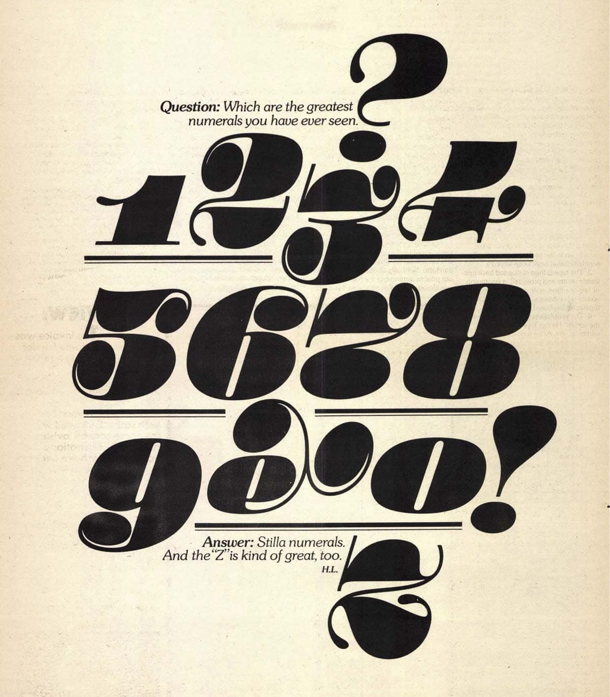
Stilla was designed by François Boltana, a Frenchman, in 1972. He submitted a preliminary set of lowercase and numerals to a typeface design competition organized by Letraset, maker of the popular rubdown letter sheets. The prestigious jury of Herb Lubalin, Roger Excoffon, Armin Hoffmann, Colin Forbes, Marcello Minale, and Derek Birdsall awarded the submission with first place. Later Boltana requested leave from his military service in Caylus, Tarn-et-Garonne, to spend a few days drawing Stilla’s uppercase for it to be published by Letraset.¹
Lubalin greatly admired Stilla – not a surprise considering how well it aligned with his own expressive style of “typographics”. He described its numerals as “the greatest numerals you have ever seen” in an ad designed for U&lc magazine. This stylistic and historical tie to Lubalin seemed like a perfect reason to use Stilla when branding our conference, which is co-organized by The Herb Lubalin Center.
Ad for Stilla designed by Herb Lubalin, published in U&lc, Vol. 1 №2, page 15, 1974
After releasing Stilla and reportedly earning virtually no royalties from its sales, Boltana became one of – if not the – first in France to sell his own type directly to users, providing digital fonts on floppy disks independent of any foundry or distributor.² He also explored the possibilities of digital type with his Champion project, begun in 1989, investigating ideas for digital glyph variants before OpenType technology provided a standard for doing so.
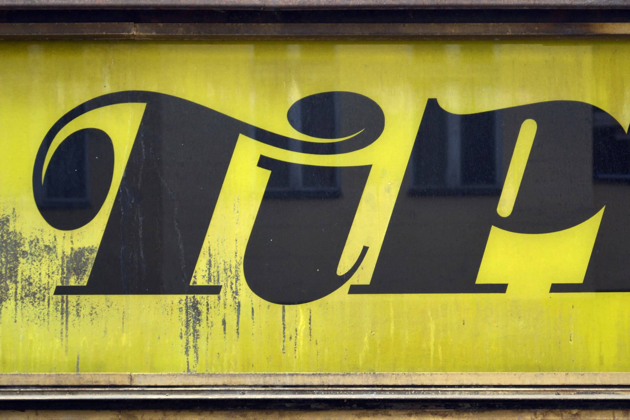
Unfortunately, Boltana’s interest in digital type didn’t lead to any superb digital update of Stilla. As with many pre-digital typefaces, Stilla’s reincarnations in the modern era have missed many opportunities for improvement and expansion. In fact, none of the three digital Stilla offerings even include the handful of alternate glyphs originally available from Letraset. They also fail to provide solutions for problematic letter combinations that otherwise require manual design modifications – something that was more reasonable to expect in the days of one-off rubdown compositions than in the template-based world of digital design.
A customized “Ti” ligature for Stilla on a German store sign. Photo courtesy of Florian Hardwig.
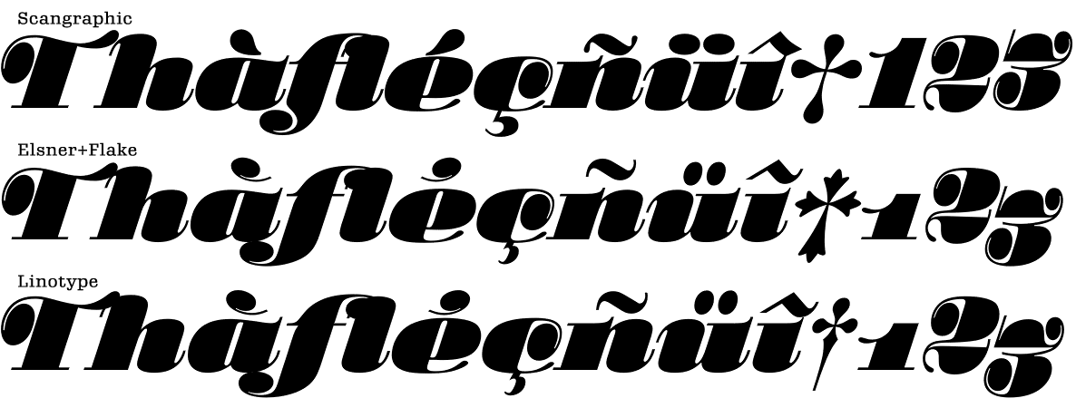
For use with the Typographics branding and website, we chose Scangraphic’s digitization of Stilla. Compared to the other versions from Linotype and Elsner+Flake, it seemed to do a slightly better job of interpreting Stilla’s original flavor for new accented characters. It also replaces Stilla’s original beautiful-but-hard-to-use numerals with a more versatile set that all aligns at the cap height. Still, it lacks support for some Eastern European characters (like the ć in one of our speakers’ last names), and could benefit from ligatures or contextual alternates for awkward character combinations like “Th” and “fl”.
A comparison shows different interpretations for diacritics, spacing, and numerals between Scangraphic, Elsner+Flake, and Linotype’s digital versions of Stilla.
Despite the desire for a better digitization of Stilla, Boltana’s vivacious design has served the conference well, helping to establish a unique visual identity. In the spirit of Erik Spiekermann’s “typeface plus color equals brand” mantra, Stilla is used with a bright primary color palette inspired partially by David Pelham’s wonderful Kites to Make and Fly book. Paired with a new yet-to-be-named typeface by David Jonathan Ross for body type and subheads, Stilla sets the Typographics branding apart visually from any other conference or design organization.
2. Jean François Porchez, personal e-mail correspondence, April 29, 2014. Porchez explained the long conversations he and Boltana had about the type business in the 1990s. ↩︎
The De Vinne Press Building as show in Types of the De Vinne Press, 1907.
On Friday, June 12, following a day of presentations at the Typographics conference, a party is scheduled at the Astor Center in the historic De Vinne Press Building at 399 Lafayette Street. Literally around the corner from the conference hall at Cooper Union, the De Vinne Press location is historically relevant to the theme of Typographics. The building was constructed in 1885–86 to house the printing and typographic facilities of Theodore Low De Vinne & Co. which at one time employed more than three hundred people.
Born in 1828, Theodore De Vinne is perhaps the greatest American scholar-printer who ever lived. Other than being a prominent typographer and printer, De Vinne was also a type historian, researcher, and printing advocate. He wrote and published books on a wide variety of topics related not only to the economic and practical aspects of printing and typography, but also on its history and style.
Around 1860 De Vinne organized owners of New York printing houses to form Typothetae, a labor union which would eventually become one of the largest graphic arts trade associations in the world. As the organization’s first president he helped establish better conditions for printers, promoted better employer-employee relationships and worked to keep printing a profitable profession.
In 1884, he cofounded the Grolier Club in New York, now the oldest existing bibliophile club in North America. Most of the early publications from the Grolier Club were authored by De Vinne and/or printed at the De Vinne Press.
Century Expanded and Century Broad-Face as show in Types of the De Vinne Press, 1907.
Among De Vinne’s most notable contributions to the history of typography is the Century series of typefaces. In 1894, as the printer of Century Magazine, he commissioned Linn Boyd Benton at American Type Founders Company to produce a new type series that would be more readable than the spindly “modern” typefaces in popular use at the time. The new typeface shared some formal qualities with the modern typefaces, but had beefed up serifs and was more sturdy overall. After the first uses of Century in 1895, the series would be updated and expanded into dozens of other variations over the years by Morris Fuller Benton and others.
Century Expanded as shown by American Type Founders Company.
As one of the most prominent typefaces commissioned by a typographer for a specific publication, Century has established precedents for custom typeface design that are still relevant today. It has also become a reference point for the design of publication type well into the digital era, inspiring typefaces like Tobias Frere-Jones’ Benton Modern series and Jackson Cavanaugh’s Harriet series. In 2014 the Grolier Club hosted an exhibition dedicated to De Vinne and published an accompanying catalogue with the first use of the Boydlow typeface, Matthew Carter’s interpretation of the Century types. For more info on De Vinne, see No Art without Craft: A Biography of Theodore Low De Vinne by Irene Tichenor.
It will be an honor to be able to host a party in the De Vinne Press Building during the Typographics conference and we hope you’ll join us.
Lettering by Tom Carnase for a booklet by Lubalin, Burns and Co., 1970
The name of the Typographics conference comes from a term often used by Herb Lubalin and Aaron Burns 50 years ago to describe typography and lettering at its best: compelling design that evokes moods and memories, or just gets your attention. The word is deceptively simple. At first read it seems just to refer to typography, as in mechanical typesetting with prefabricated fonts, but reading more closely you recognize that it entwines two concepts: Typo and Graphics. It ties the practice of graphic design together with an active engagement with the shape of words and letters.
The best examples of this approach create active participation, an active reader, because it works both as text and image. Herb Lubalin, one of the most consistent practitioners of typo-graphics, described his approach: “...I am interested in type forms and in the use of typography as an illustrative medium where the words become more expressive than they actually are.” Lubalin, Burns, and their contemporaries helped revolutionize American advertising, by making text visually more playful, and more central to the overall design of the ad, rather than simply being a caption to an image.
The ties to Herb and Aaron at Cooper Union are very strong, as the Herb Lubalin Study Center houses their archives. The revival of this term for this conference seems a fitting homage to their legacy. Their outlook was always towards the future. Typographics 2015 will provide a platform for emerging & established designers to gauge where typography is today and where its future may lie.
Composing Room specimen booklet designed by Aaron Burns.
Aaron Burns was born in 1922 in Passaic, New Jersey, and began his career in design as an apprentice to a graphic designer after he left the Army at the end of World War II. That job led to other short spells in design until making the transition to the typesetting side of things. In 1952 he became director of design and typography at the Composing Room, an important and influential typesetting shop in New York, where he worked with some of the best typographic designers on the cusp of the typographic revolution. He eventually opened his own business in 1963, and in 1970 together with Herb Lubalin and Ed Rondthaler he founded International Typeface Corporation. ITC developed new typefaces and marketed them to subscribers, and was one of the first type companies to pay a royalty to the designer and also one of the first to focus on licensing typeface designs separate from physical typesetting equipment.
His time and position in the major New York typesetting shops gave him a platform for typographic experimentation. It is during that period that Burns developed into a keen typographic ‘middle-man’, whose great insight, taste, and interpretations would bridge the wide gap between the designer and typesetter, who impossibly expected each to know the minute details of the other’s respective craft. He was very active in educating designers about the potentials of typography, teaching about it in design schools but also creating forums for discussions about the state of type. He was chairman of the world’s first seminar on typographic design, “The Art and Science of Typography” in 1958, and in 1959 he chaired the “Typography U.S.A.” forum which presented some of the best typographic design in the country. He also sought to bridge the gap between American and European typography, helping to connect and inform each side of what was happening across the ocean. He co-founded the International Center for the Typographic Arts, which had more than 1,000 members in 33 countries.
Aaron left an indelible mark on the way typographic design was shaped. Without him the design and typography would have been starkly different, and much worse off.
Cover of the special edition of Idea magazine (Japan) focusing on Herb Lubalin, 1969.
Herb Lubalin was born in New York City in 1918, and graduated from The Cooper Union School of Art in 1939. After a series of design jobs in book and magazine publishing he joined the studio of Sudler & Hennessey in 1946, before opening his own studio in 1964. It is at S&H that he made his reputation as a virtuoso of typography, although he wouldn’t call it that. “What I do is not really typography,” he said. “I think of typography as an essentially mechanical means of putting characters down on a page. I design with letters. Aaron Burns calls it ‘typographics’ and since you’ve got to put a name on things to make them memorable, ‘typographics’ is as good a name as any for what I do.”
Herb Lubalin’s four-decades-long career revolutionized American advertising and editorial design. His ideas were instrumental in changing designers’ attitudes and approach towards typography. Lubalin said, “nobody was bothering to fool around with the way you form the letters themselves.” That is exactly what he did. Letters became objects, objects were transformed into letters. He was a proponent of tight spacing, saying, “We read words, not characters, and pushing letters closer or tightening space between lines doesn’t destroy legibility; it merely changes reading habits.” His pioneering work for Eros, Fact, Avant Garde, and U&lc magazines made designers look at the page and letterforms in a completely new way.
Here is a nice reminder from Herb: “It is our responsibility as designers not only to make order out of the printed word, but to make it memorable as well, and thus better understood. This will help people to communicate. The better people communicate, the greater will be the need for better typographics—expressive typography.”