
A design festival for people who use type
Stilla & François Boltana
The flamboyant French fatface of Typographics and its creator

Stilla as shown in a Letraset catalog from 1989
One of the key elements in the branding for this year’s Typographics conference is the exuberantly bold and swashy typeface used for the logotype and other display type: Stilla.
Stilla was designed by François Boltana, a Frenchman, in 1972. He submitted a preliminary set of lowercase and numerals to a typeface design competition organized by Letraset, maker of the popular rubdown letter sheets. The prestigious jury of Herb Lubalin, Roger Excoffon, Armin Hoffmann, Colin Forbes, Marcello Minale, and Derek Birdsall awarded the submission with first place. Later Boltana requested leave from his military service in Caylus, Tarn-et-Garonne, to spend a few days drawing Stilla’s uppercase for it to be published by Letraset.¹
Lubalin greatly admired Stilla – not a surprise considering how well it aligned with his own expressive style of “typographics”. He described its numerals as “the greatest numerals you have ever seen” in an ad designed for U&lc magazine. This stylistic and historical tie to Lubalin seemed like a perfect reason to use Stilla when branding our conference, which is co-organized by The Herb Lubalin Center.
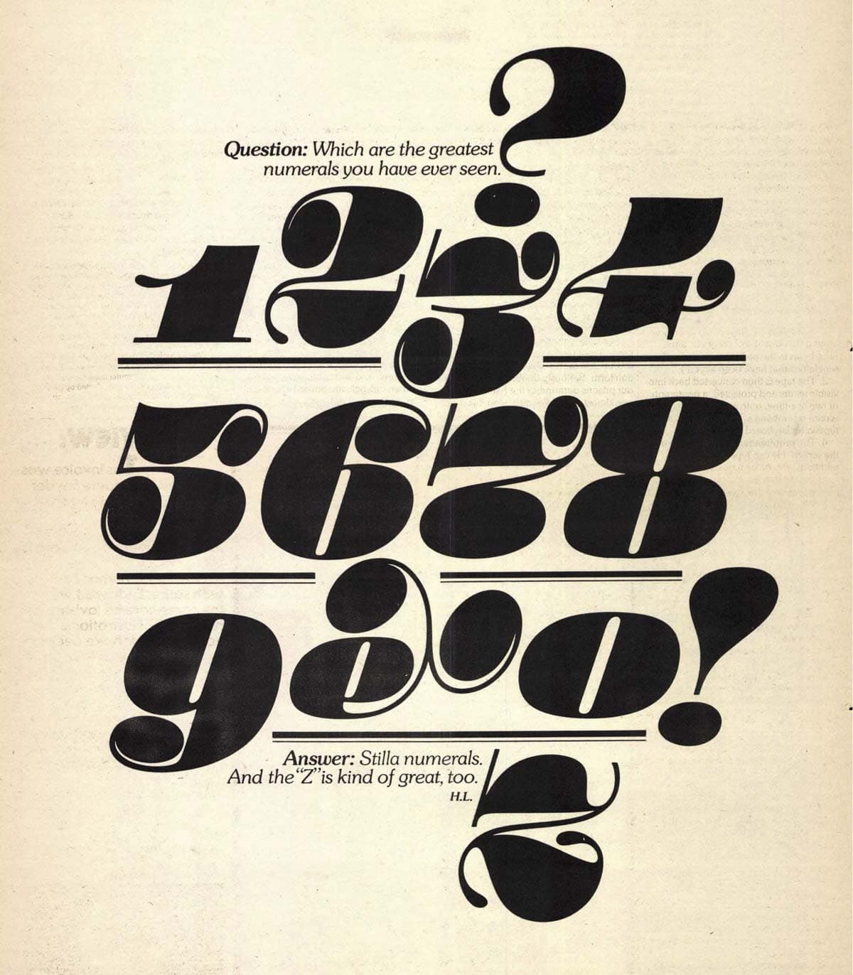
Ad for Stilla designed by Herb Lubalin, published in U&lc, Vol. 1 №2, page 15, 1974
After releasing Stilla and reportedly earning virtually no royalties from its sales, Boltana became one of – if not the – first in France to sell his own type directly to users, providing digital fonts on floppy disks independent of any foundry or distributor.² He also explored the possibilities of digital type with his Champion project, begun in 1989, investigating ideas for digital glyph variants before OpenType technology provided a standard for doing so.
Unfortunately, Boltana’s interest in digital type didn’t lead to any superb digital update of Stilla. As with many pre-digital typefaces, Stilla’s reincarnations in the modern era have missed many opportunities for improvement and expansion. In fact, none of the three digital Stilla offerings even include the handful of alternate glyphs originally available from Letraset. They also fail to provide solutions for problematic letter combinations that otherwise require manual design modifications – something that was more reasonable to expect in the days of one-off rubdown compositions than in the template-based world of digital design.
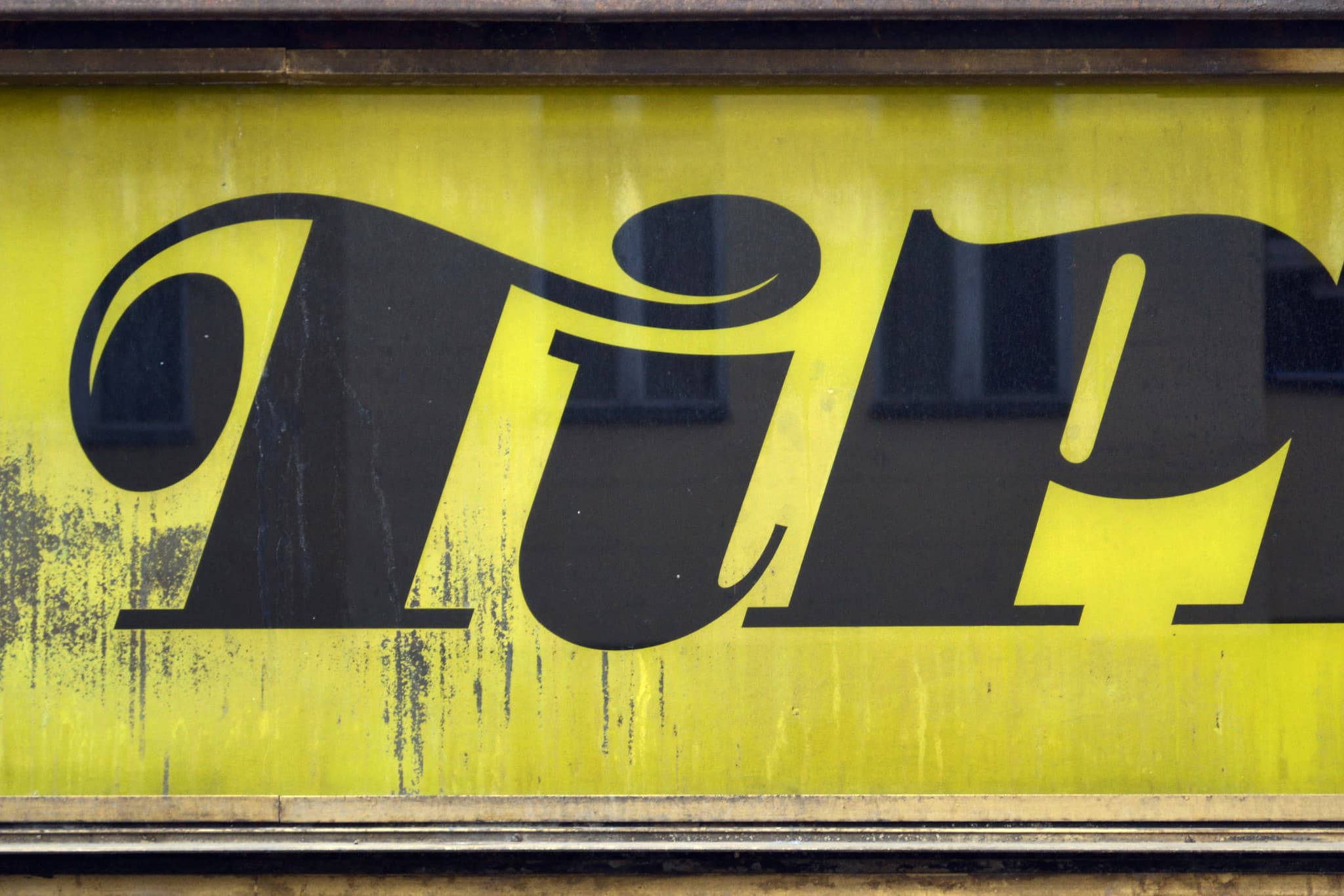
A customized “Ti” ligature for Stilla on a German store sign. Photo courtesy of Florian Hardwig.
For use with the Typographics branding and website, we chose Scangraphic’s digitization of Stilla. Compared to the other versions from Linotype and Elsner+Flake, it seemed to do a slightly better job of interpreting Stilla’s original flavor for new accented characters. It also replaces Stilla’s original beautiful-but-hard-to-use numerals with a more versatile set that all aligns at the cap height. Still, it lacks support for some Eastern European characters (like the ć in one of our speakers’ last names), and could benefit from ligatures or contextual alternates for awkward character combinations like “Th” and “fl”.
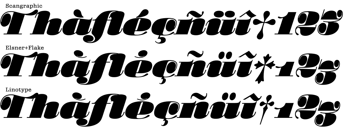
A comparison shows different interpretations for diacritics, spacing, and numerals between Scangraphic, Elsner+Flake, and Linotype’s digital versions of Stilla.
Despite the desire for a better digitization of Stilla, Boltana’s vivacious design has served the conference well, helping to establish a unique visual identity. In the spirit of Erik Spiekermann’s “typeface plus color equals brand” mantra, Stilla is used with a bright primary color palette inspired partially by David Pelham’s wonderful Kites to Make and Fly book. Paired with a new yet-to-be-named typeface by David Jonathan Ross for body type and subheads, Stilla sets the Typographics branding apart visually from any other conference or design organization.
The information available in English on Stilla or Boltana is sparse, but Frank Adebiaye and Suzanne Cardinal’s book, François Boltana & la naissance de la typographie numérique, is a definitive source for information in French.
1. Frank Adebiaye and Suzanne Cardinal. François Boltana & la naissance de la typographie numérique. Atelier Perrousseaux, 2011. Many thanks to Frank for providing some translations. ↩︎
2. Jean François Porchez, personal e-mail correspondence, April 29, 2014. Porchez explained the long conversations he and Boltana had about the type business in the 1990s. ↩︎