
A design festival for people who use type
The time before desktop fonts
Learning to adapt to the future of design by looking at changes from the past
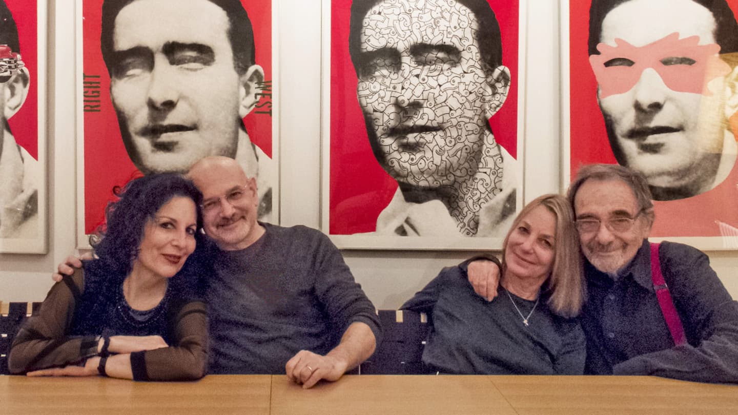
Louise Fili, Steven Heller, Paula Scher, and Seymour Chwast.
New York’s two most celebrated design couples – Louise Fili & Steven Heller and Paula Scher & Seymour Chwast – happen to be long-time friends. Typographics is bringing them together for a little reminiscence about the good old days of typesetting shops, repro proofs, and pasteup. Or maybe they were the bad old days.
Heller was an art director at The New York Times for 30 years. He recalls the difficulty of getting everything straight in a pasteup using waxed galleys – and the occupational hazard of getting some of the wax up your nose.
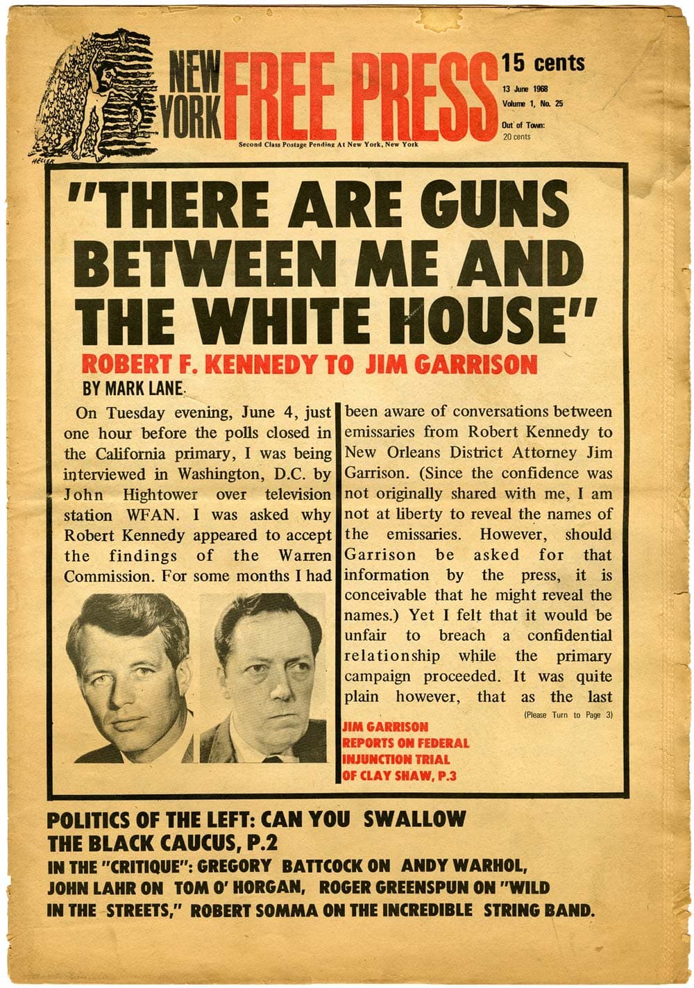
A 1968 cover of The New York Free Press, design by Steven Heller, showing slightly wobbly cold-type pasteup. Image courtesy of Steven Heller.
Fili finds irony in the fact that when using the latest phototype back in the day, “We were tyring to make things look new, and now we are doing everything we can, with the latest technology, to make it all look old!”
Chwast, before he co-founded Push Pin Studios, also worked at The New York Times, in the promotional department. He recalls getting type out of the composing room, combining it with an illustration, and sending it back down to the engraving room. “And then we had to wait six hours!”
Scher agrees it was not all that great. There was a lot of time involved. A lot of late nights – in publishing, the music business, and advertising. Messengers sometimes arrived in the middle of the night with corrected proofs, and you would wait up for them. Or you would have to rush to the airport to put the package for the printer on a plane to LA.
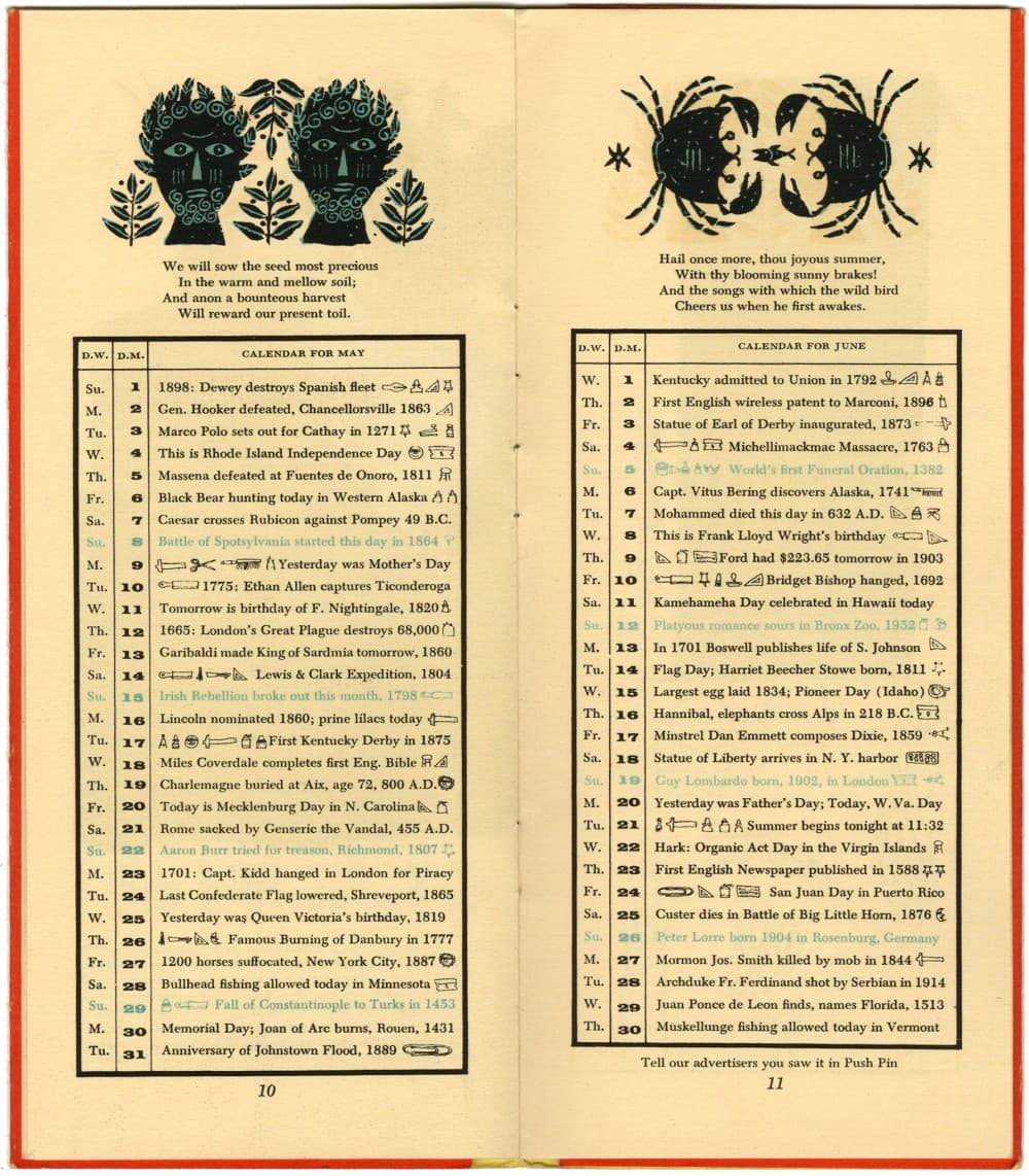
Spread from a Push Pin Almanack calendar, hand-composed line by line in 6-pt type by Seymour Chwast, 1954. Image courtesy of The Herb Lubalin Study Center.
Twenty years later, there are fading memories of the workflow that involved paper proofs of type. You could combine repros of metal type, with phototype headlines, galleys of text, and even dry transfer lettering – resize them in photostats – and paste it all together on a board that went out to be shot for litho film.
“I’m not sure anyone wants to bring all that back, but sometimes it was really fun,” says Heller.
It wasn’t just a workflow, it was a culture.

Holiday promotional item for the Lubalin, Smith, Carnase & Peckolick design studio, designed by Louise FIli circa 1975. Fili also made the soup. Image courtesy of The Herb Lubalin Study Center.
I caught up with Steve at the QVED conference in Munich earlier this year, and he updated me on Louise’s latest work. Then I saw Paula and Seymour at the New York magazine art director’s reunion for SPD in New York. It occurred to me to ask both couples to come to Typographics and share of a little of their great history, and they said yes!
Today, Louise, Steve, Paula, and Seymour need no introduction. They have been well-known designers since these old days, and enormously influential. They have continued to adapt to change. That’s the point of this session. You can’t expect that the way we do stuff now is the way it will always be. I’m looking forward to hearing their own experiences, and their strategies for survival. Their session will be a very personal collection of stories, and a few slides, for the first morning of the Typographics conference.